BRIEF
00
TMB is the main public transport operator in Catalonia and a benchmark public mobility company in Europe and the world. The application provides complete information regarding bus and metro. Due to the excess information available in the mobile app and website, It is often difficult to acquire the right information.
“How might we make it easier for tourists and locals to navigate Barcelona, and to make using public transport and exploring the city more delightful.”.
The challenge was to break down the information in consumable size to help navigate the city in stages.
APPROACH
01
Team : 4 Members
Tools : Sketch and Illustrator | Mapbox | After effects | Invision
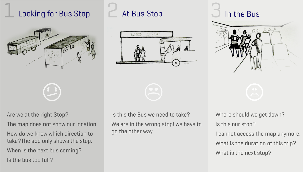
Current Journey Map As a team we documented the current painpoints that the users face when they go through three different phases of reaching a destination from A to B.
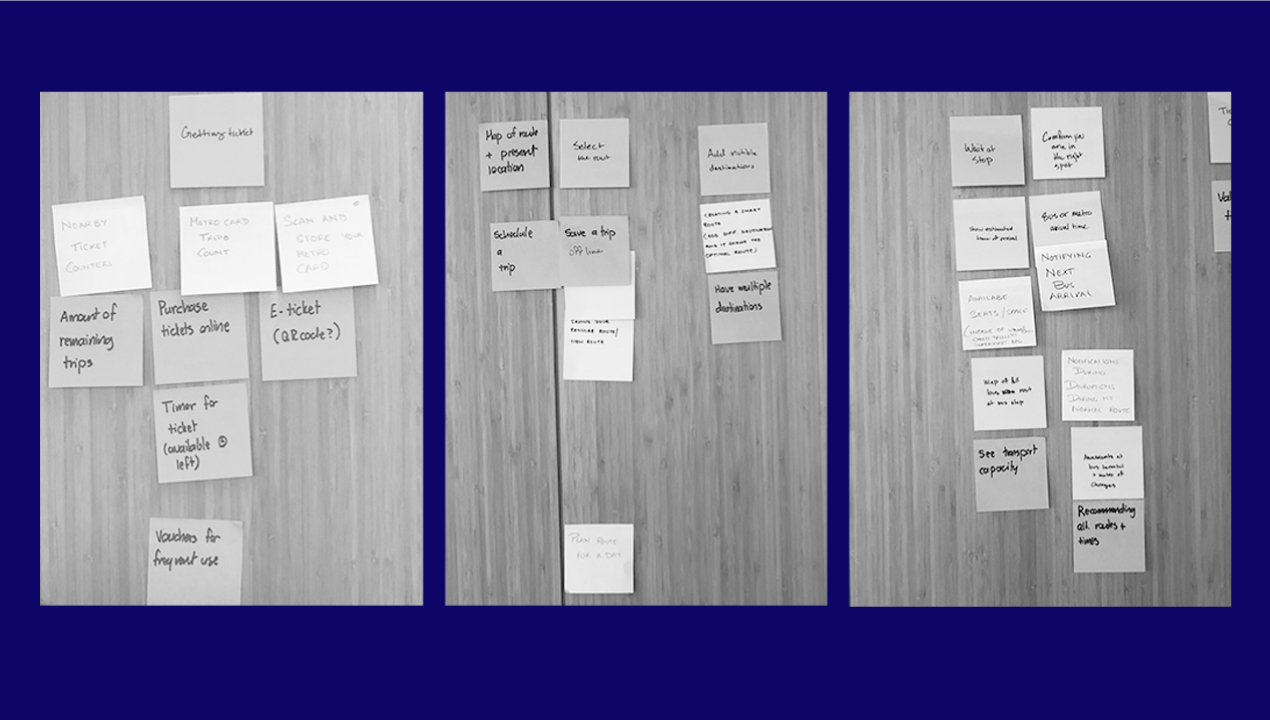
Brainstorming We broke down the process to understand the journey from two different lenses. One from the lense of a tourist and the other, a local. The goal was to provide the most relevant information at different phase of the journey and breakdown the content in a consumable size. The app was discussed to be a native app, so that in the future route could be saved offline.
UX Challenge :
One of the many challenges of this project was that the TMB website and user app had excess information. Barcelona has 32 Million tourists in comparison to 1.6 Million locals, it was essential to design the app to be tourist friendly.
We needed to think of a way for users to easily find their nearest stop and give enough guidance regarding the direction of their journey.
Even though the metro stations were self-explanatory, the Bus stop designs failed to convey the information in the most efficient way.
Barcelona is known for parties and celebrations there are constant changes in schedules of public transport as well as bus routes which are not very prominent within the app. Another key challenge we encountered was the use of a generic map on the current TMB website. It was extremely important to include a personalized map with all the landmarks highlighted to improve the navigation within the city.
Site Audit of current App :
From analyzing the usage of the current app, we discovered that map was not a primary feature of the app. The information was communicated in the form of text sometimes in spanish. Navigation was not very intuitive and it did not communicate the current status of the journey for the user.
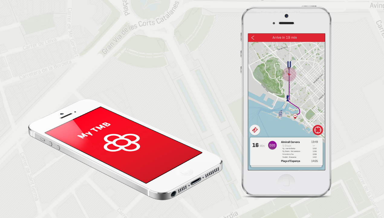
One of the primary features that stood out to me was the design of the map itself. It was not designed specific for Barcelona. I quickly jumped in to design maps using open street map or map box. As a team we decided the design of the map to drive the rest of the design direction.
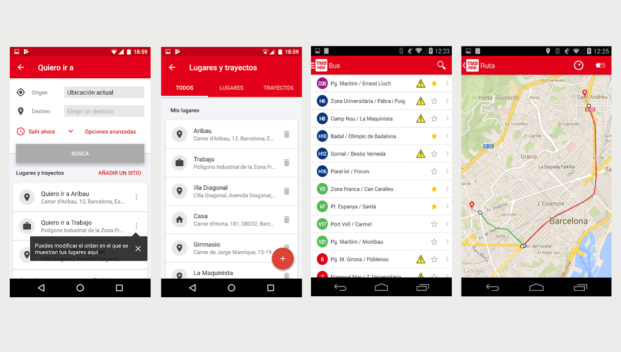
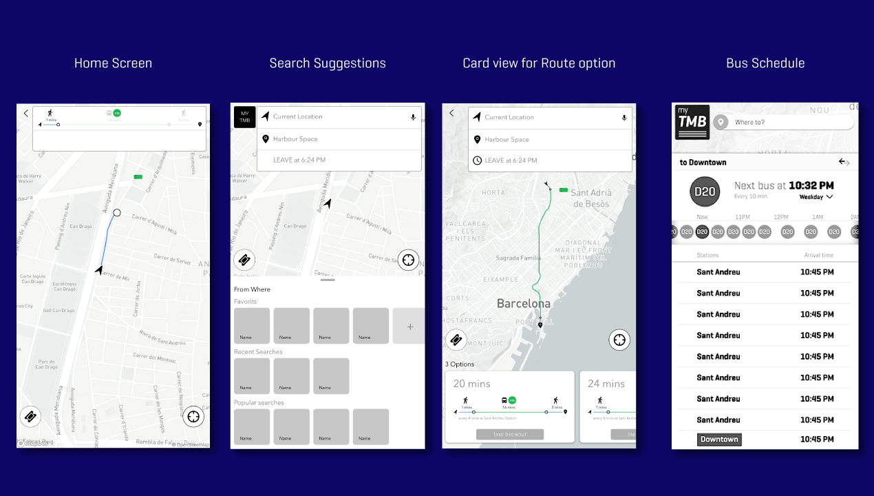
Current App : From left to right showcases screens for choosing your destination, saved destination, schedule and map view.
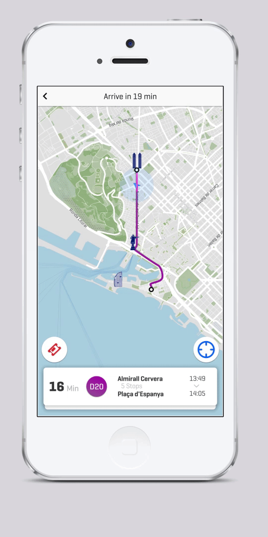
The Map :
Map was the driving unit of the entire app. We took a conscious decision to showcase the map at every point of the navigation in order to give a sense of spatial orientation.
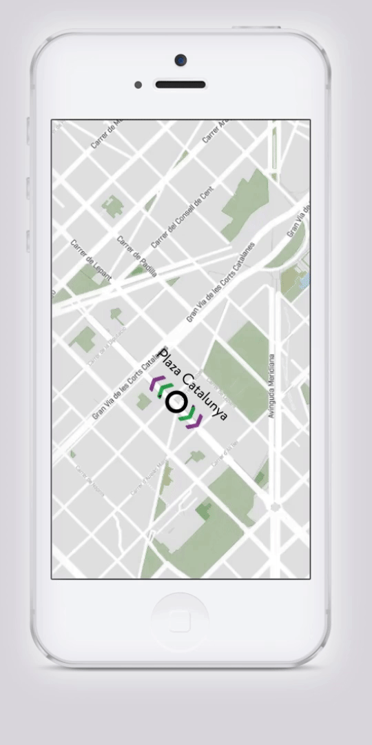
Another key concern with the design of the map was to ensure it was seen irrespective of the sun's glare. I constantly tested various saturation of the three tones that constituted on the map to finalize the right color that could be used to convey the message clearly.
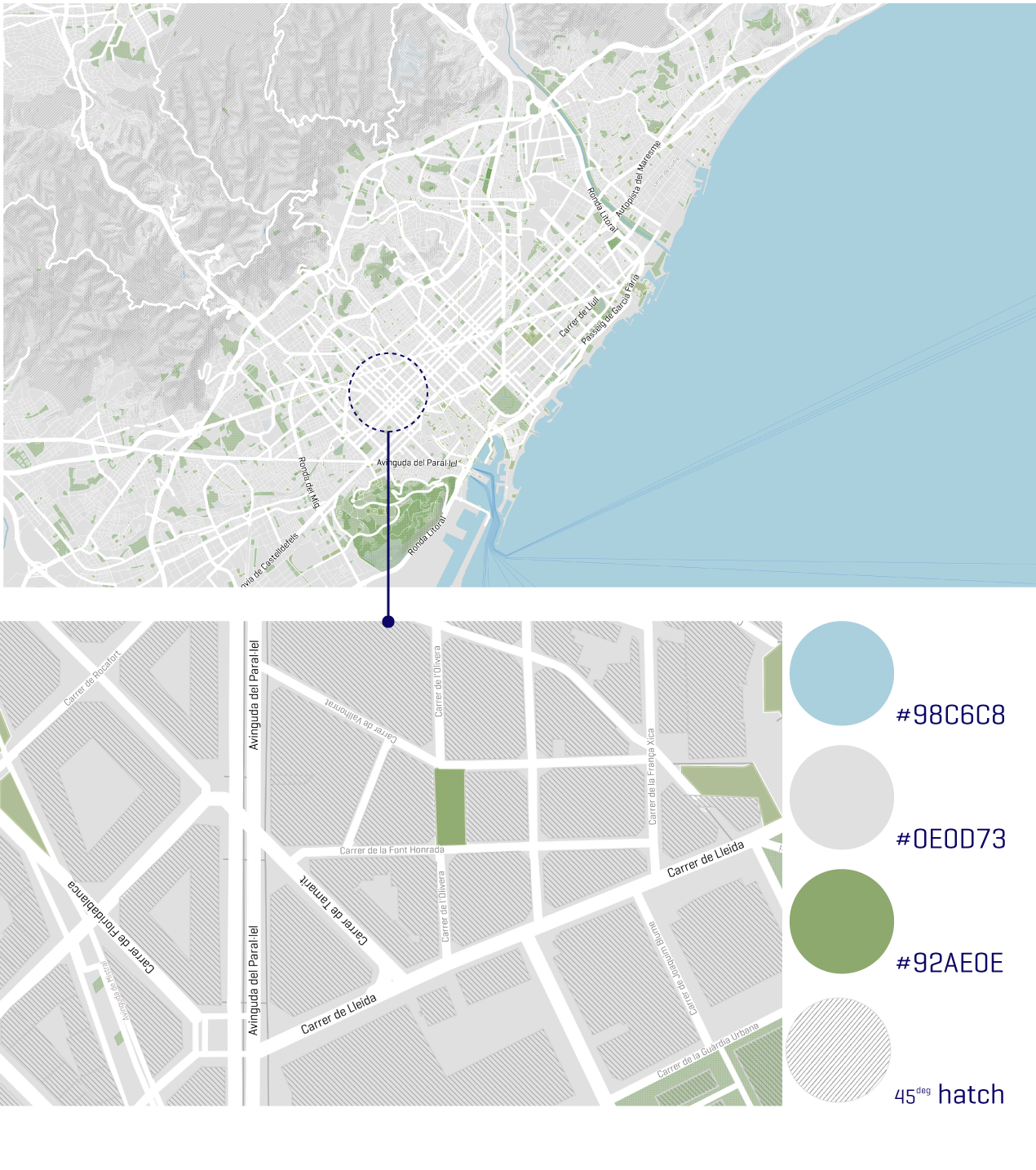
Map designed using Mapbox.
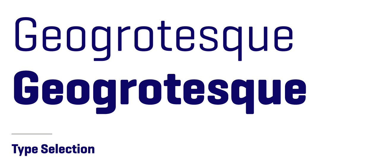
Type :
I chose a type that was very geometric and condensed. It was a decision based on the utilitarian characteristics of the type face. Geogrotesque had well defined characters that could be seen well on the map at various scales.
Icons :
I chose a type that was very geometric and condensed. It was a decision based on the utilitarian characteristics of the type face. Geogrotesque had well defined characters that could be seen well on the map at various scales.
UX Flow : We created a flexible structure to balance the two states of recommended destinations and manually entering the destination detail pages. We also signalled if there was a disruption on the way or a delay while waiting for the bus. We included a map of the route to help users get the information that they needed at every point of their journey. The stop to get off or board was indicated with the notion of cards and motion.
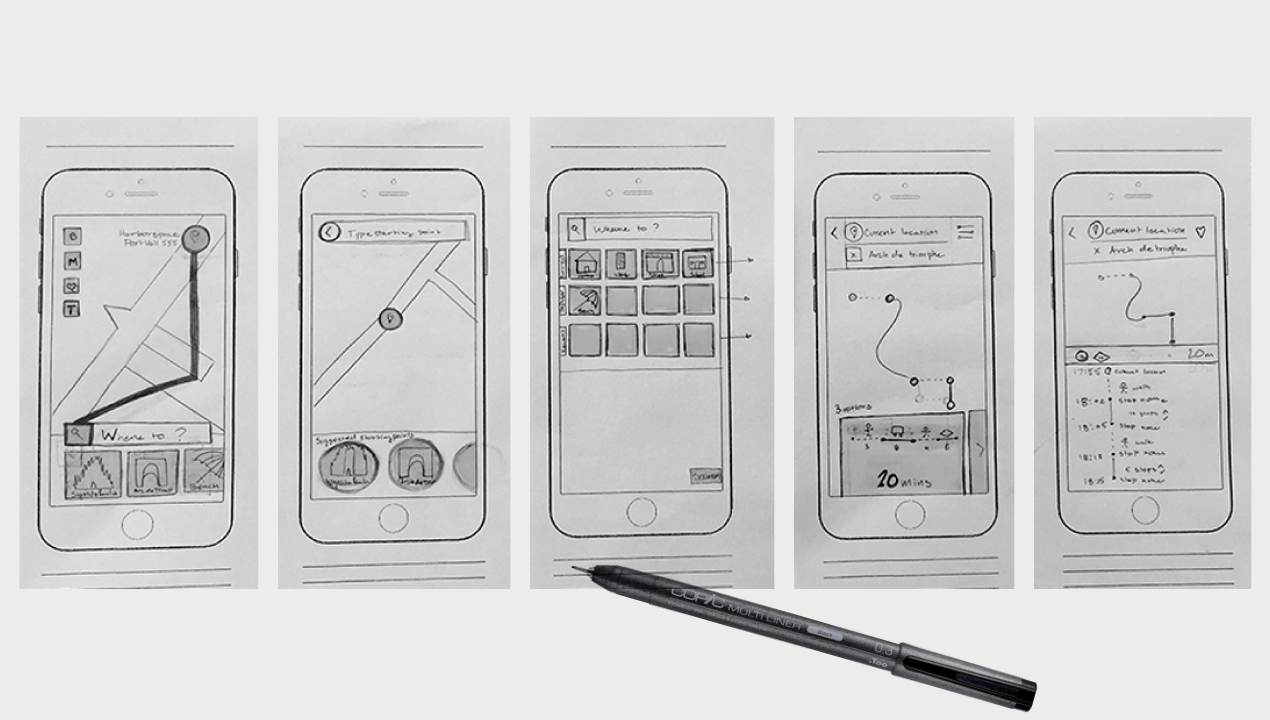
Sketches for the flow of selecting a destination and carrying out the journey
Low fidelity mockups of the flow from travelling from A to B.
UX Solution : The design decisions for the user flow was taken keeping in mind to focus the user at the current task. The map is almost framed through design to help prioritize the information.
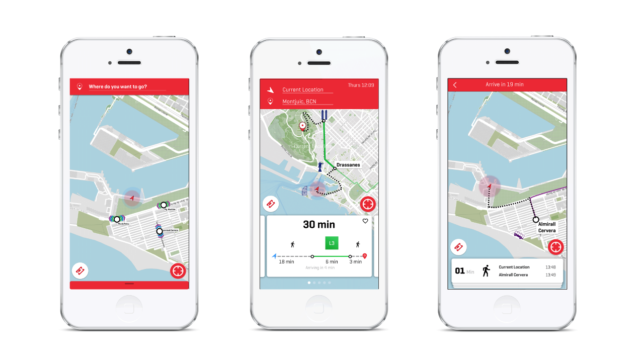
Screens from left to right : Choosing a destination, choosing the optimum route, first phase of the journey.
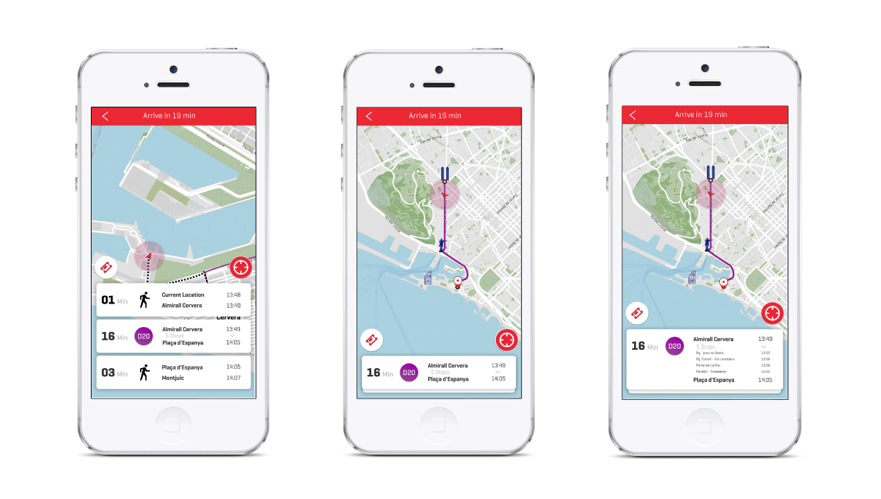
Screens from left to right : Three steps to reach destination, The next stop to get off, Second layer of information showcasing the number of stops prior to the user' stop.
Screens from left to right : Micro interactions to identify the bustop depending on the direction to be taken. A constant painpoint mentioned by the current app users ; Second micro interaction is a visual que to the direction of the journey..
Feedback from others
"
Juneza is very hardworking and is not afraid to try new things very quickly which is a huge plus (where a lot of people might feel scared by new software of feel not confident just to try learning new skill). Great with creating visuals and really tries to understand content before visualizing it (which is also rare for designers)."
— Anton Repponen
(Creative Director and Co-Founder at Anton & Irene Studio)